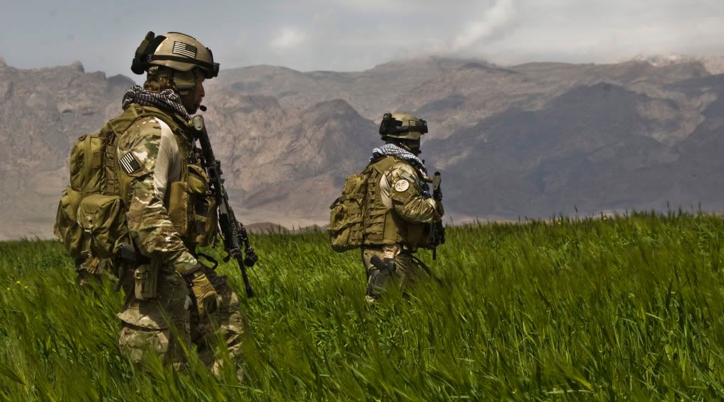
just a quick stop-by from my painting session today. I´ve finally started to work on my Human Interaction team and picked one guy to be the guinea pig for trying a new color-combination to get a rough representation of Multicam in 20mm:
Just did the trousers, easier to stop and repaint if things go awry.
Its just rought-going to determine the overall coloring, I didn´t fiddle with minor details to get the scheme exactly right. I´m not quite concinved if its still too dark or okay that way - but its certainly an improvement over my first version.
For comparison:
I guess its still too dark and much to rough (especially the white splotches), but getting closer to the real thing. Any ideas on how to improve it further?


From a rough guess it looks okay so far, but is MUCH MUCH too green!
ReplyDeletetry a more brownish tone and smaler areas of green.
That could give you uniform the right touch.
Like this one:
http://soldiersystems.net/blog1/wp-content/uploads/2011/06/MultiCam-Web-Overlay.jpg